


Von Natur verzaubern lassen.
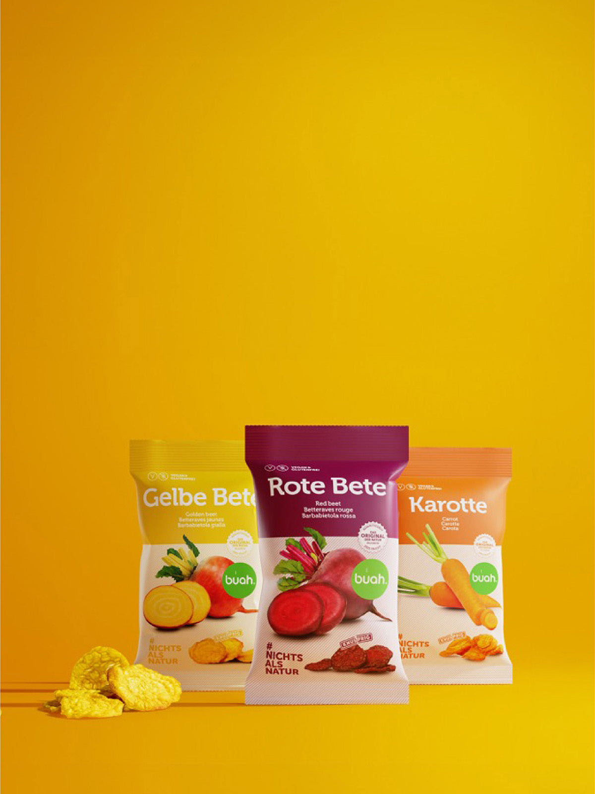
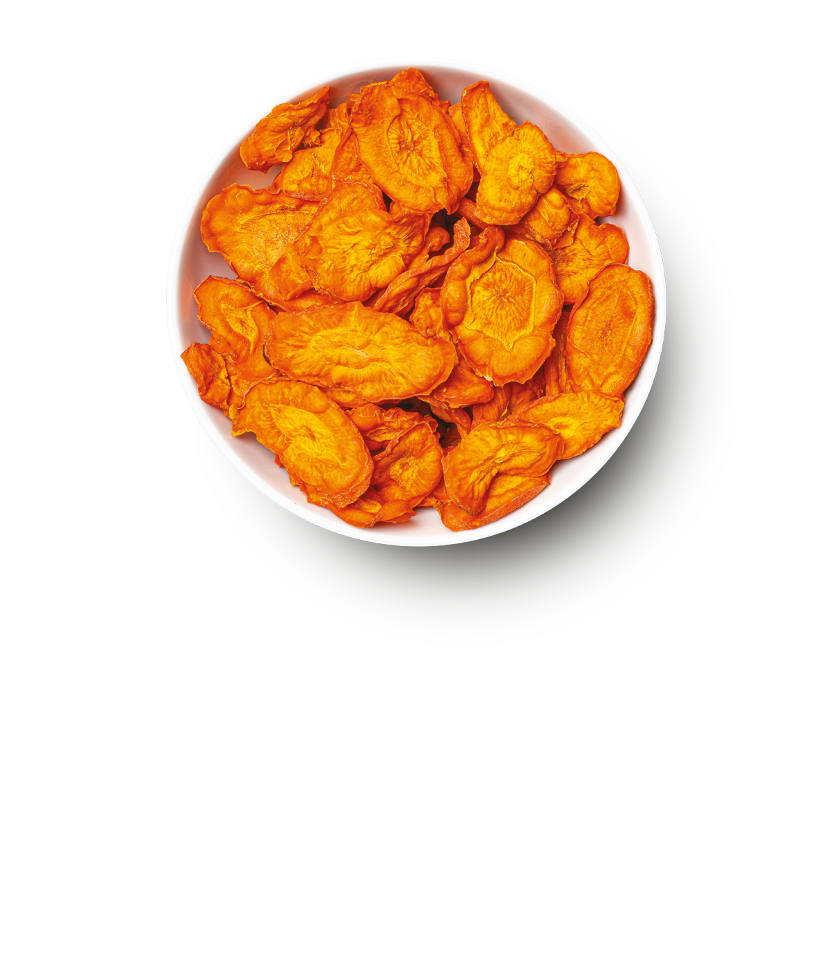
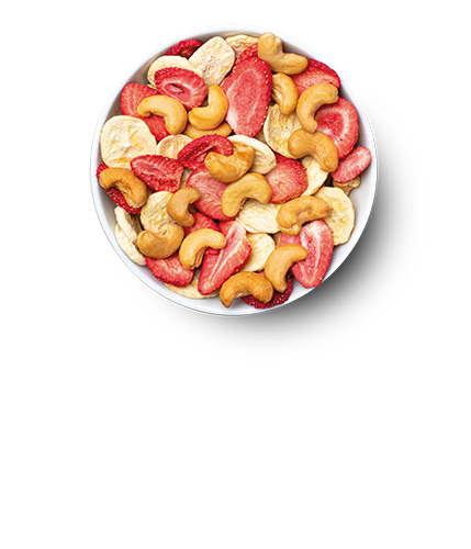
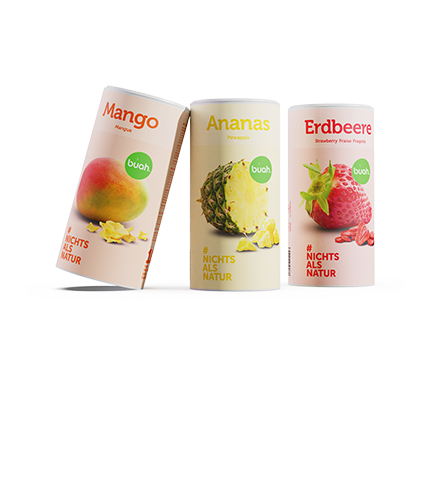
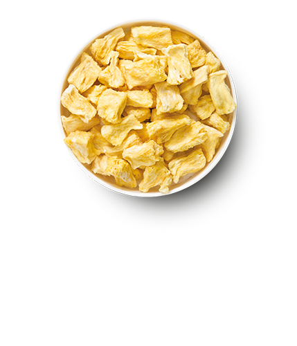
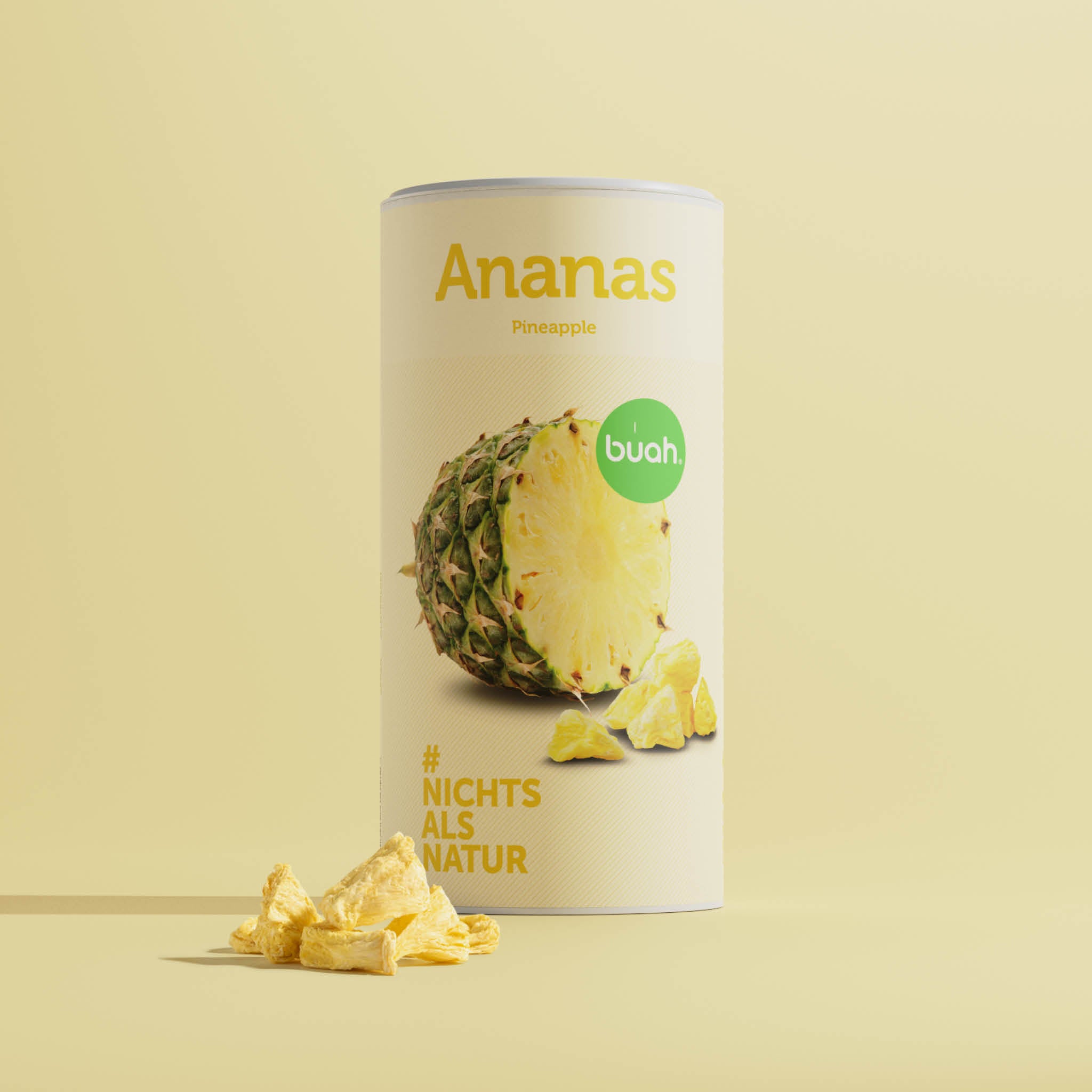
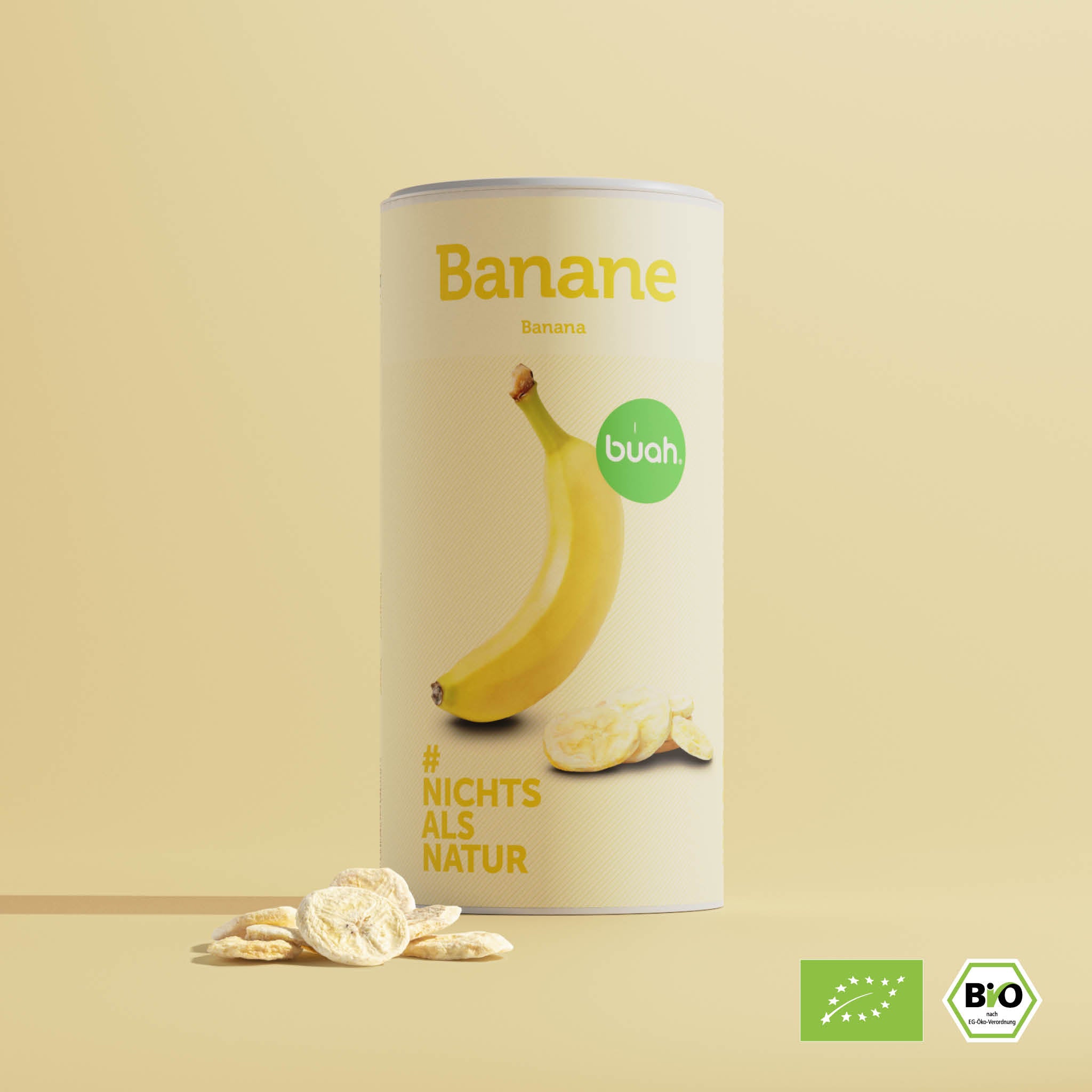
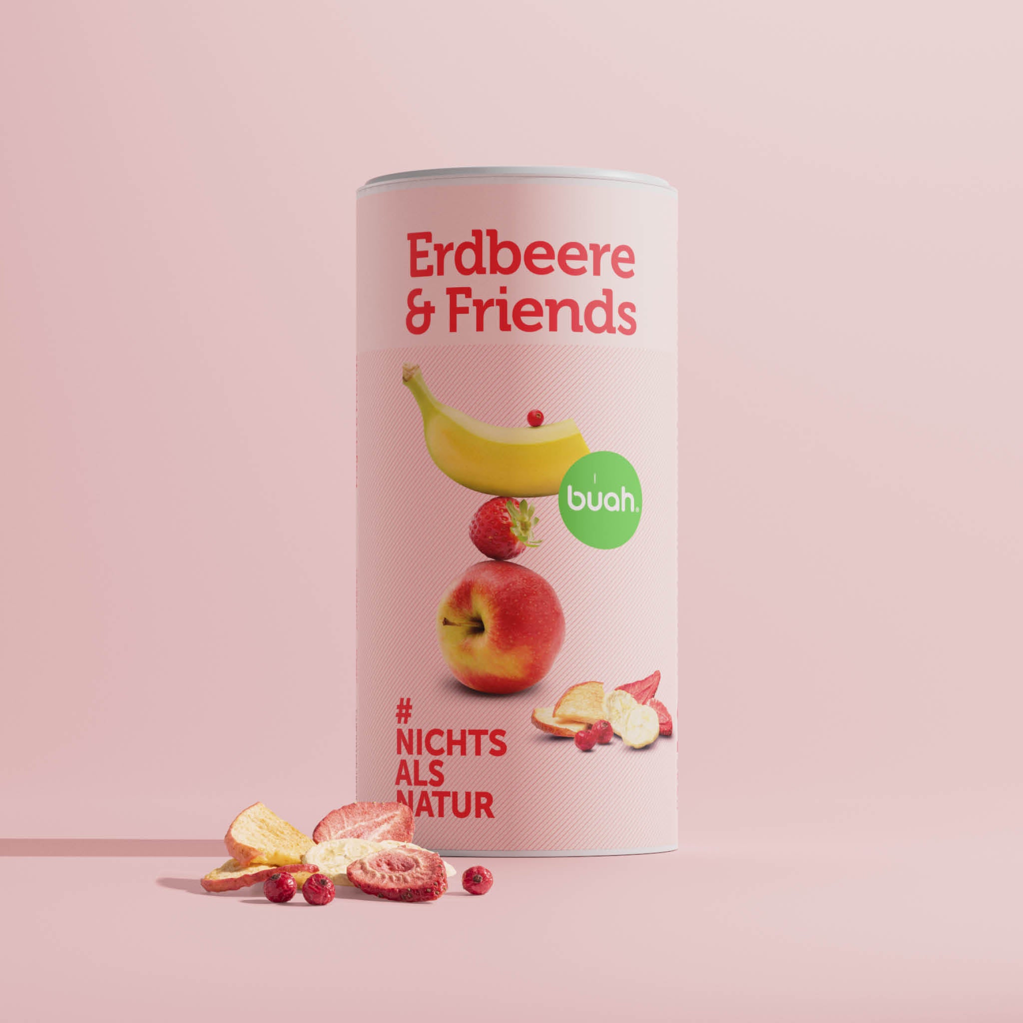
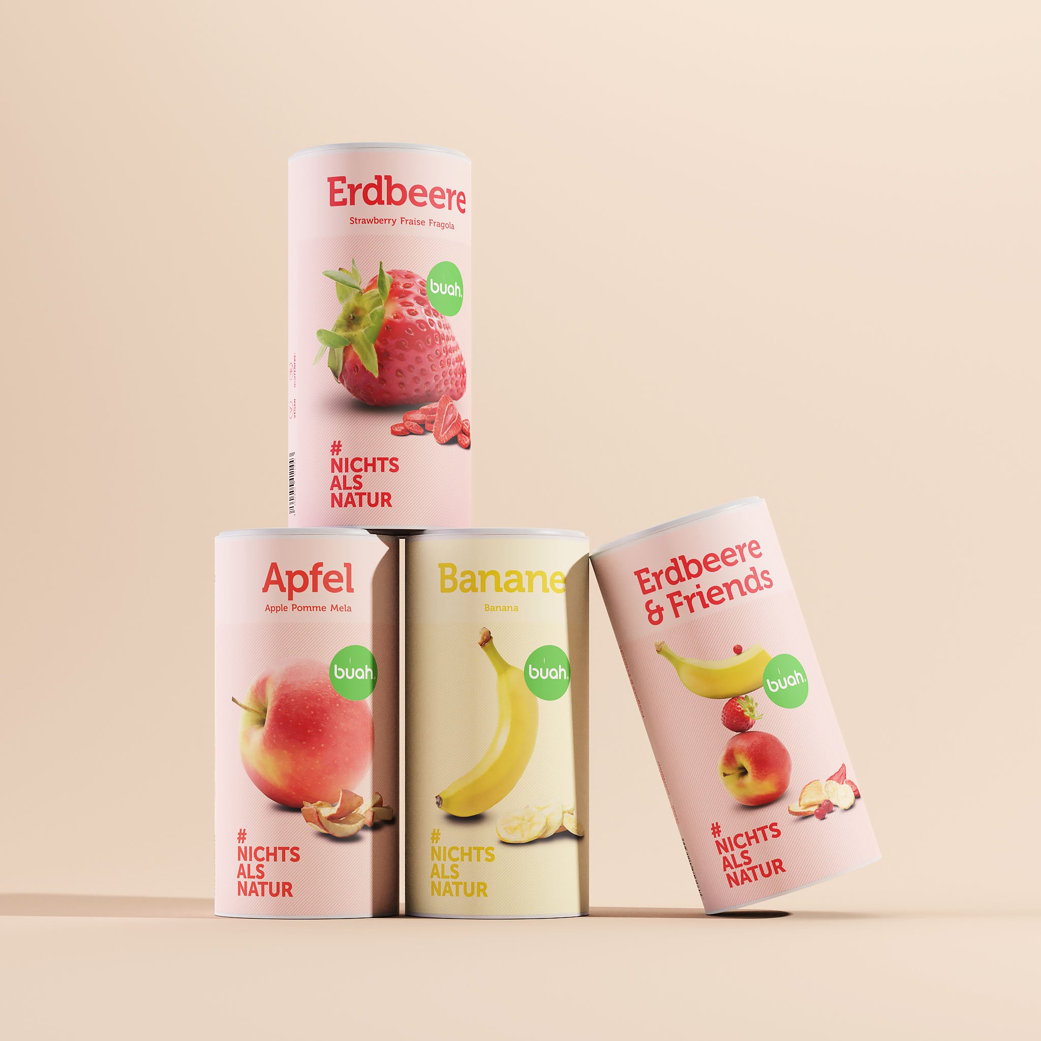
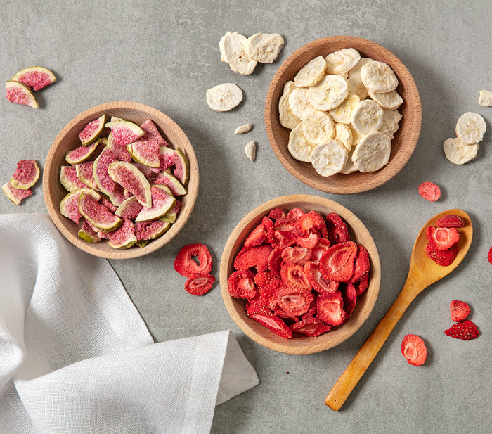
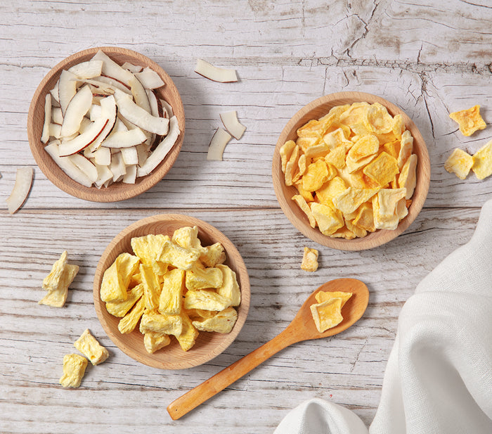
Beliebte buah Produkte.
Warum sind unsere gefriergetrockneten Früchte so lecker?
Das Original der Natur.
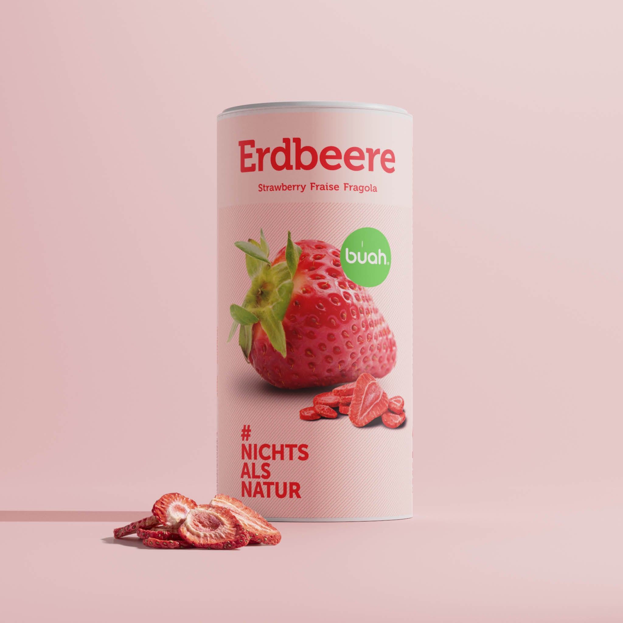
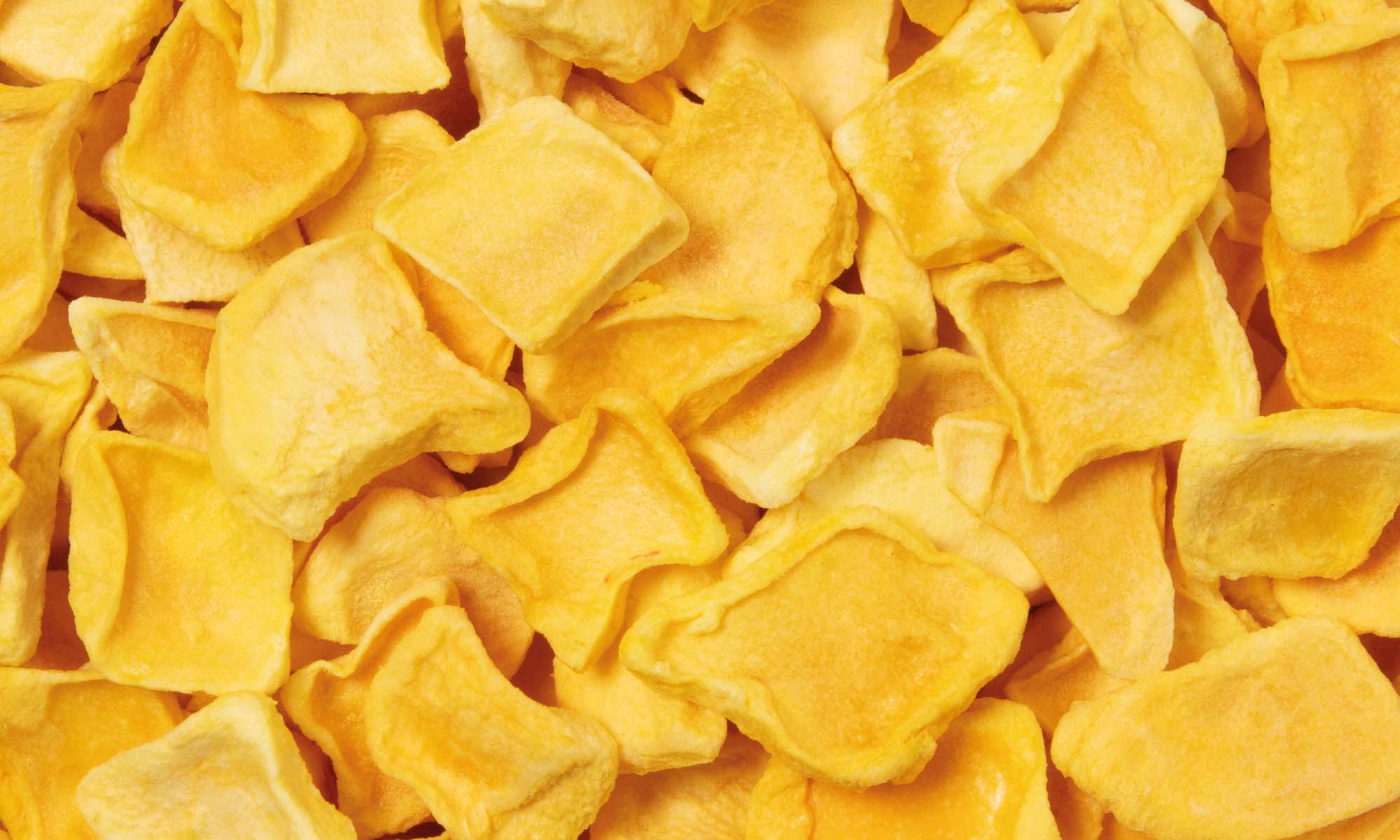
100% pure, reife Früchte.
Unsere gefriergetrockneten Früchte werden in ihrer vollen Reife geerntet. Von Natur aus perfekt geformt und mit wertvollen Nährstoffen ausgestattet. Mit uns werden sie zum idealen Snack. Wundervoll crunchy, mehrere Monate haltbar und 100 % fruchtig.
#NichtsalsNatur
0% Zusätze.
Der fruchteigene Zucker versüßt unser gefriergetrocknetes Obst ganz natürlich. Wir lieben es und glauben, dass Du es auch lieben wirst. Daher lassen wir unsere Früchte so, wie sie sind, ohne Industriezucker, ohne Konservierungsstoffe, ohne Zusätze.
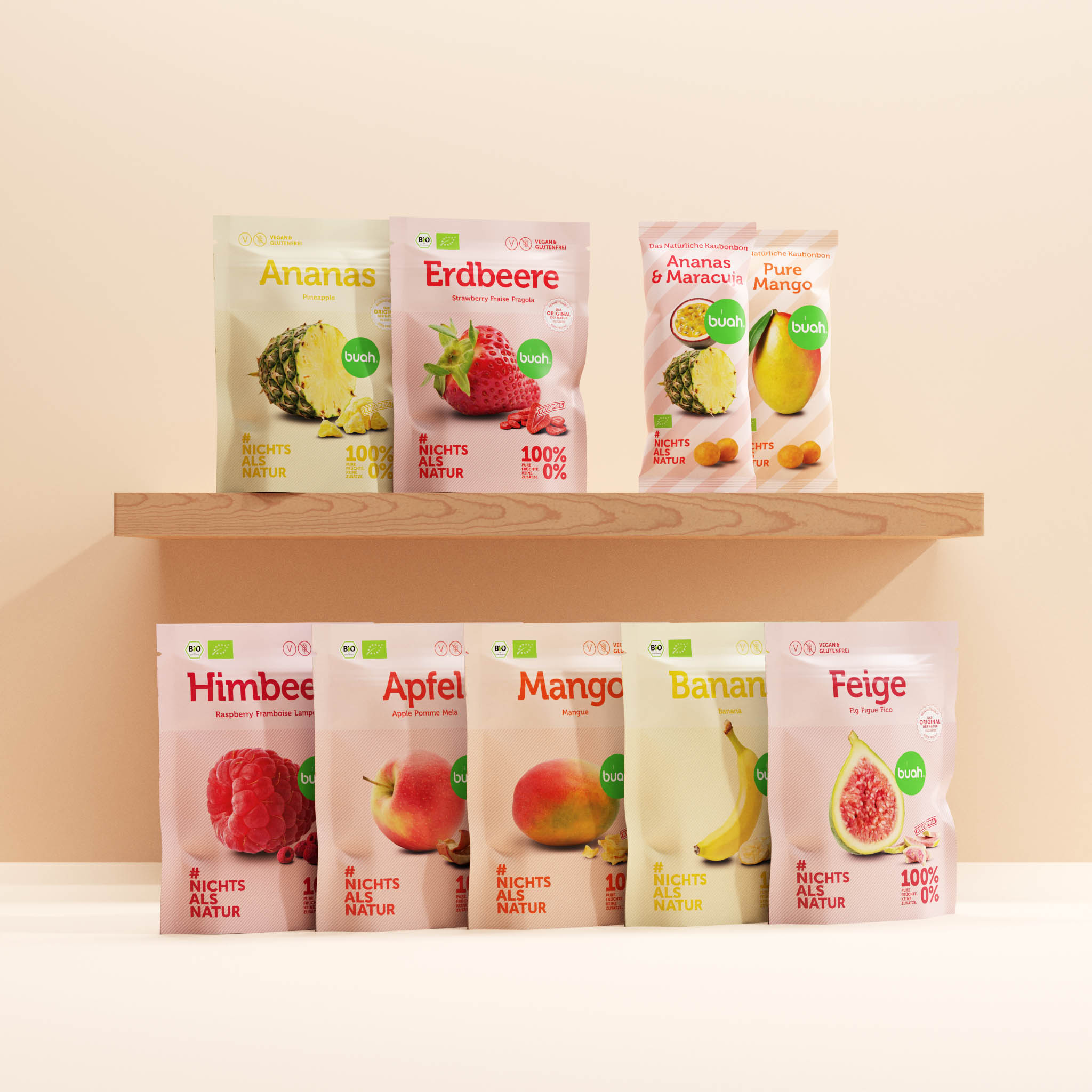
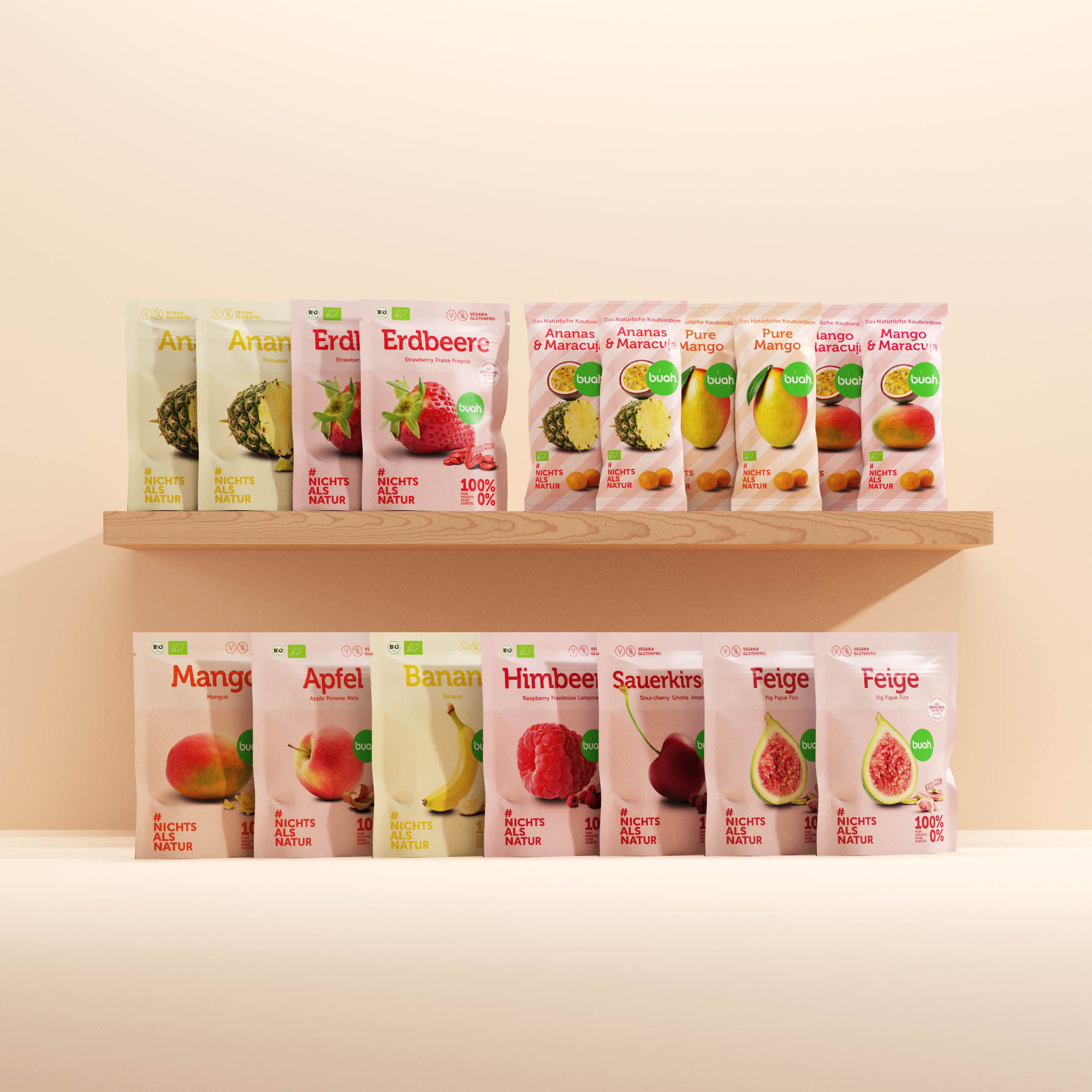
Probieren geht über Studieren.
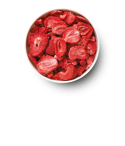
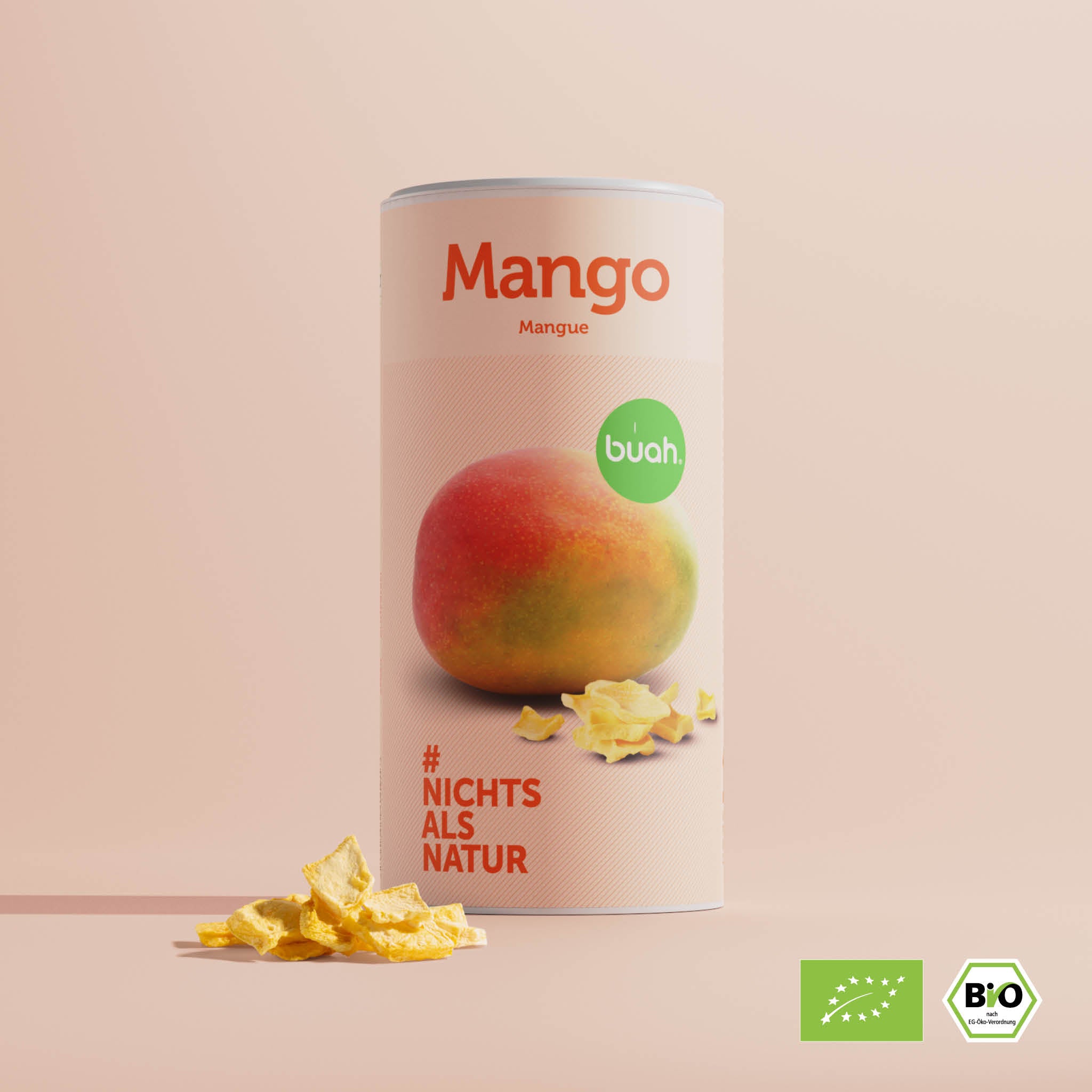
Welche gefriergetrockneten Früchte schmecken Dir am besten?
Magst Du es lieber tropisch süß wie die Mango oder süß-säuerlich wie unsere Erdbeere oder voll sauer wie unsere Sauerkirsche?
Teste Dich durch und finde Deinen individuellen buah Früchtetyp heraus.
Vorstellung Gefriertrocknung.
Wie frisch gepflückt. Jederzeit und überall.
Unsere vollreifen Früchte bleiben für mehrere Monate reif, frisch und knusprig. Das liegt an der Gefriertrocknung. Durch das Schockfrosten wird dem Obst ein Großteil seines Wasseranteils mittels Vakuum entzogen. Zurück bleiben die Früchte in ihrer natürlichen Form, Farbe und Aroma, gepaart mit dem unwiderstehlichen Crunch.
Frisch
Gefriergetrocknet
Probiere es selbst.
30 Tage testen.
Bestimmt liebst Du unsere buah Produkte genauso wie wir, doch für den Fall der unwahrscheinlichen Fälle geben wir Dir eine Geschmacksgarantie auf unsere Produkte. Wenn es Dir nicht schmeckt, dann schicke sie innerhalb von 30 Tagen an uns zurück.
Zur Geschmacksgarantie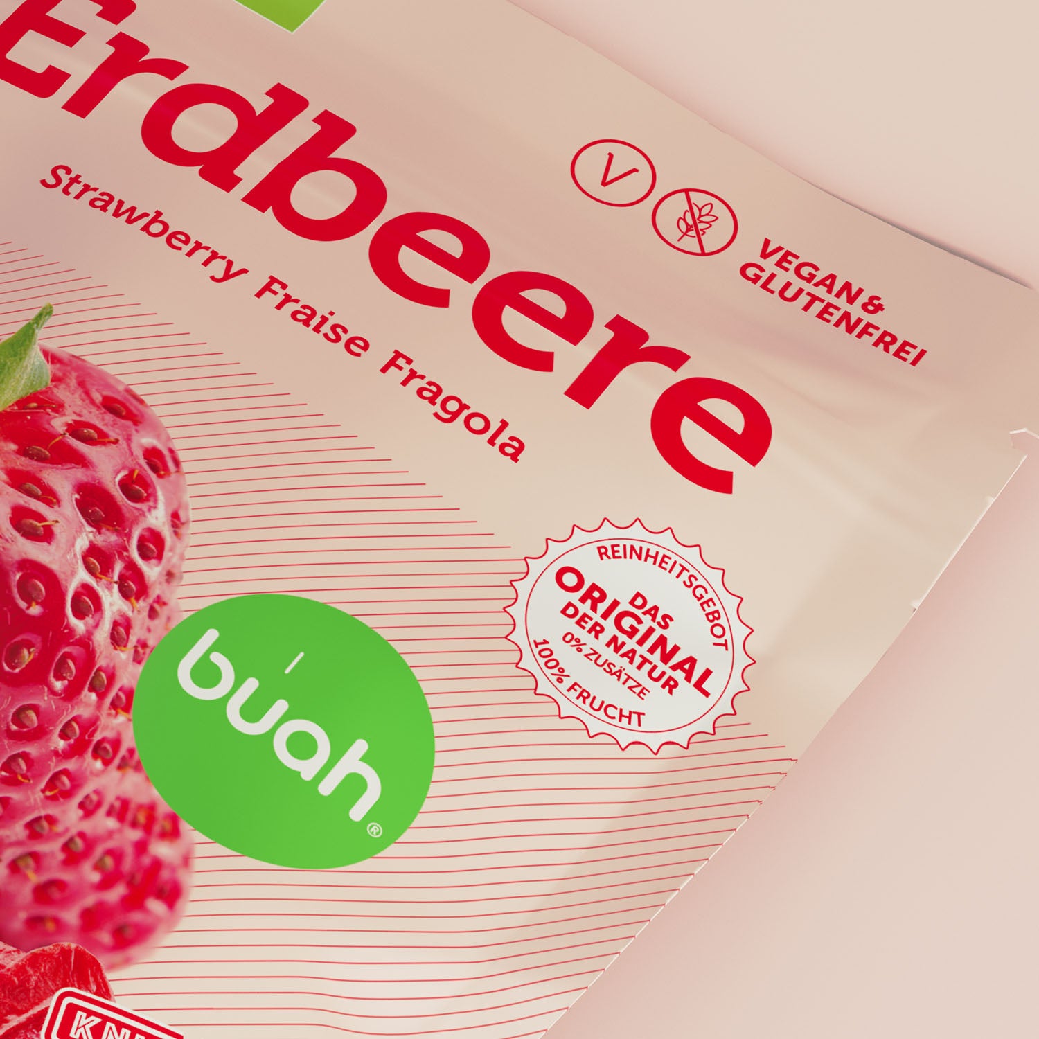
buah Reinheitsgebot.
So rein wie Mutter Natur.
Es gibt wohl kaum wichtigere Dinge im Leben als Gesundheit und Zufriedenheit. Und da die meisten unserer Empfindungen durch den Magen gehen, wollen wir bei buah uns ganz sicher sein, dass da nur Gutes hineinkommt.
So haben wir ein Reinheitsgebot verfasst, das Dir zeigt, wie ernst wir unsere Mission nehmen.
- #nichtsalsnatur
- ohne zugesetzten Zucker
- keine Zusatzstoffe und E-Nummern
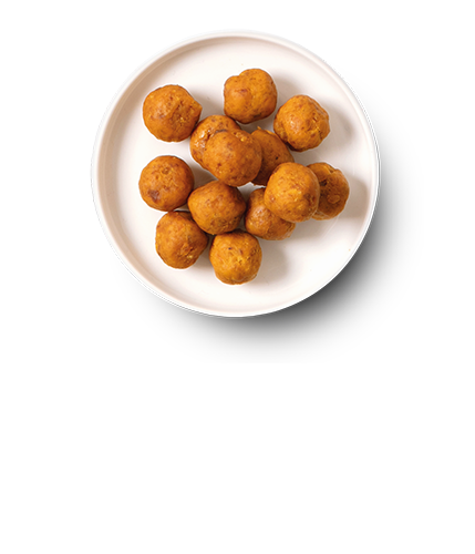
Lecker und vielfältig.
Das kannst Du mit den gefriergetrockneten Früchten zaubern.
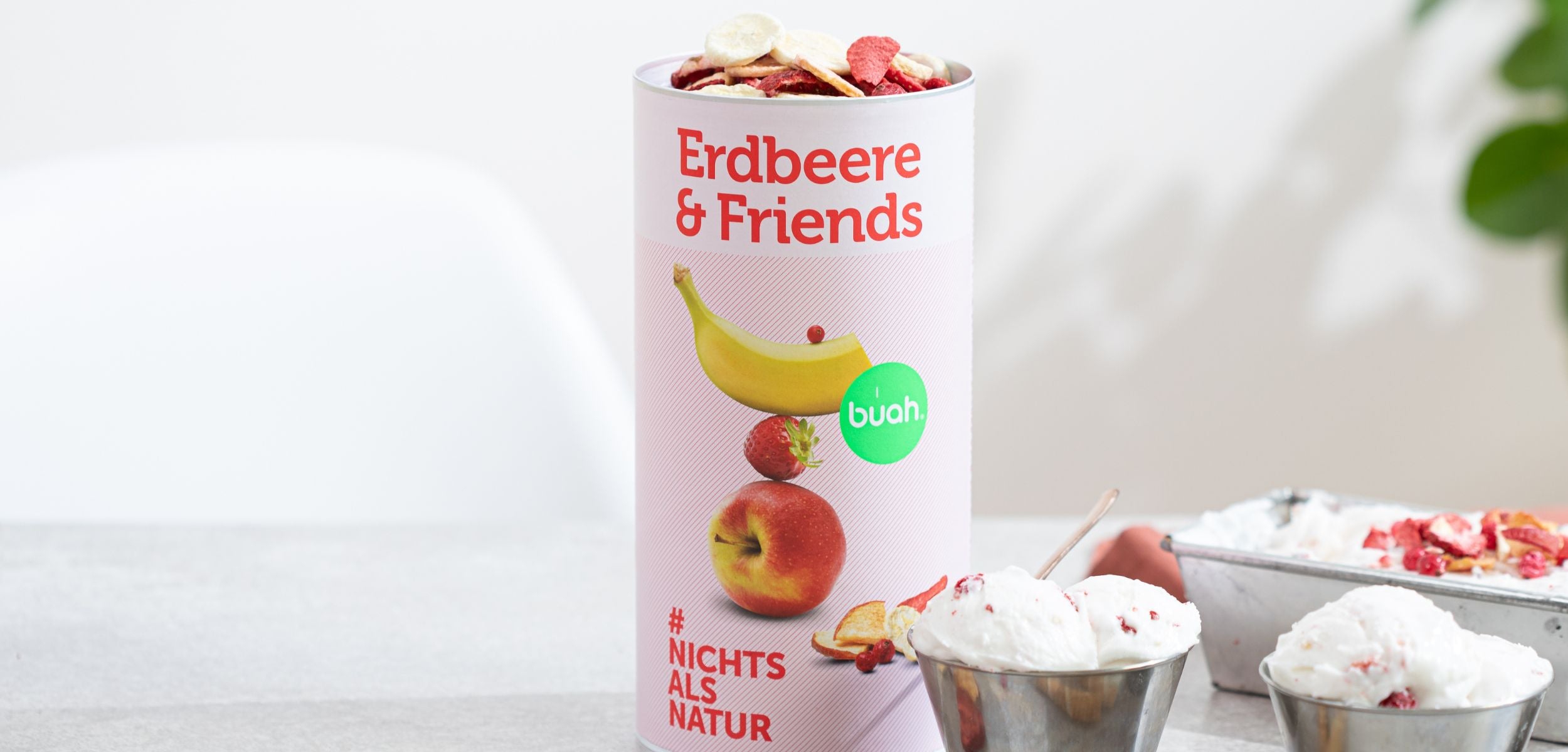
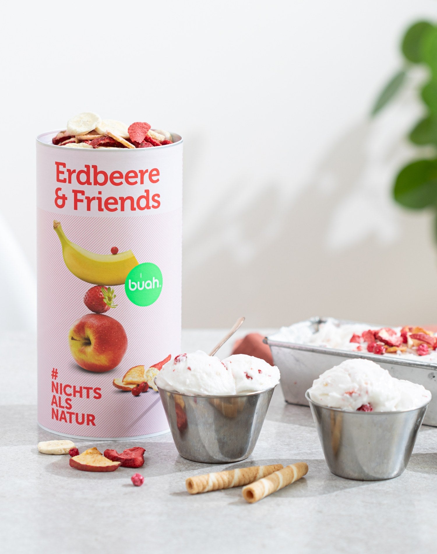
Knackig, süß, unwiderstehlich.
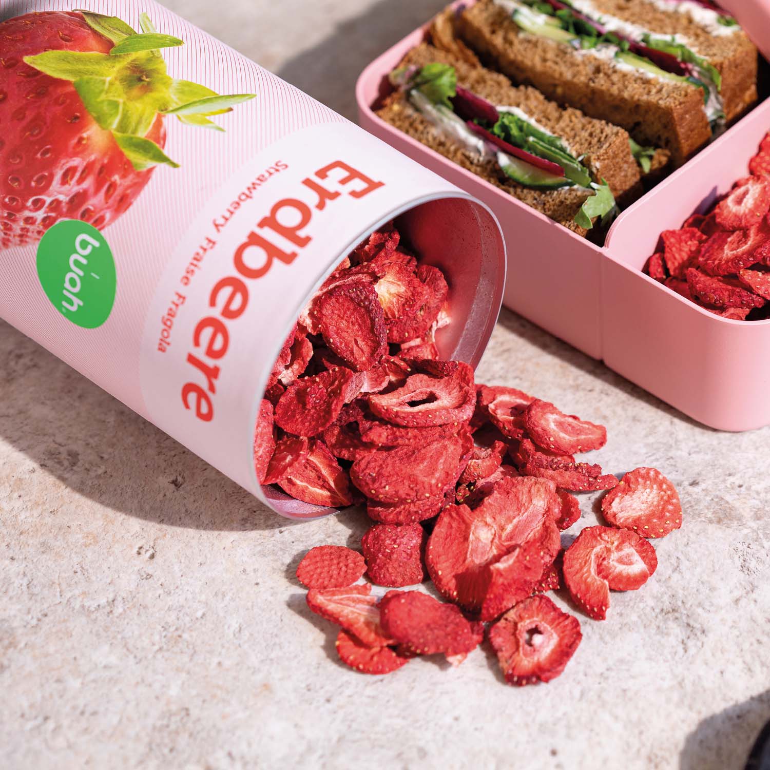
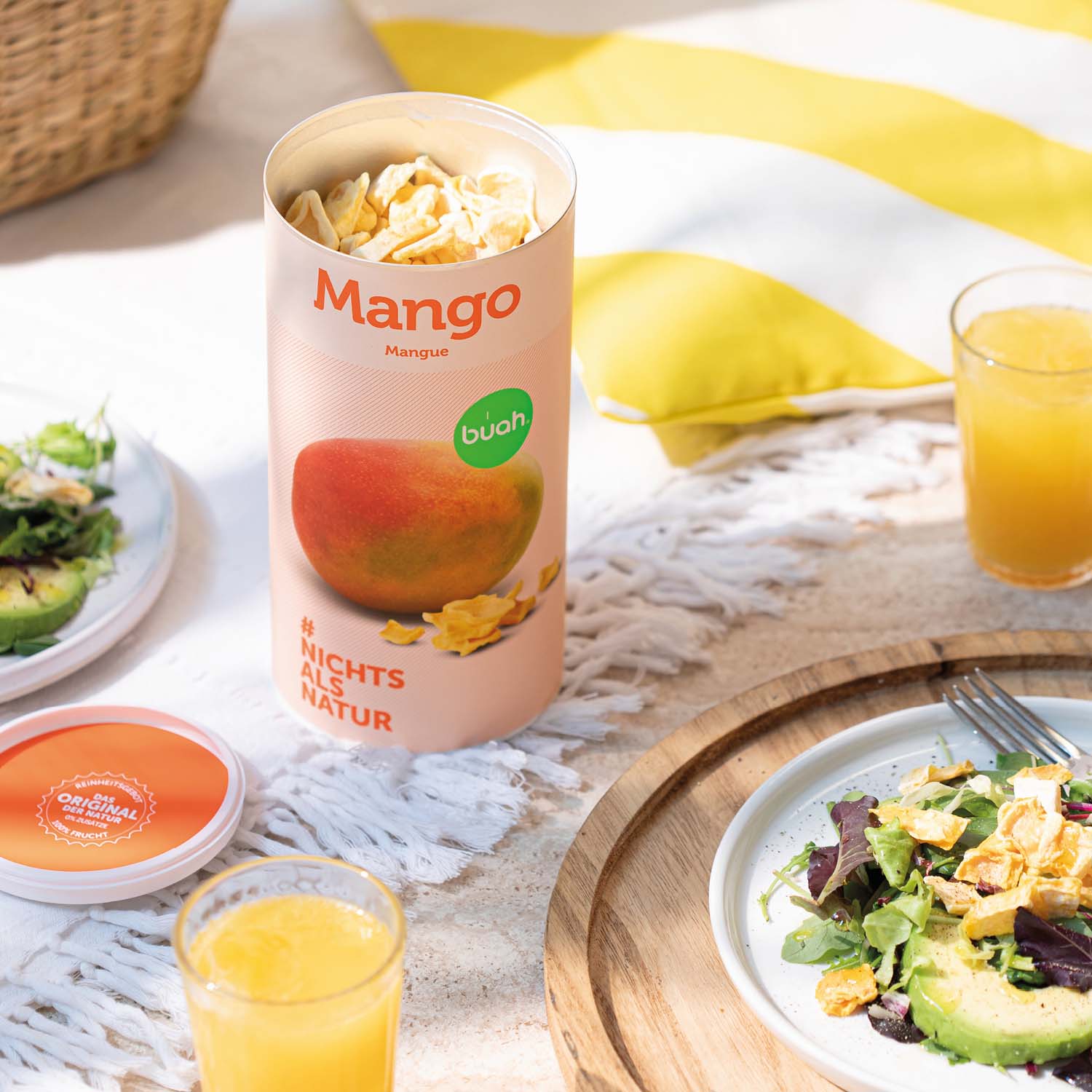
Als crunchy Topping sind unsere Früchte das i-Tüpfelchen auf Deiner Lieblingsmahlzeit. Hier gehts zum Knusperglück Erdbeere & Friends.


Willkommen im buah Bestsnacker-Club.
Snacken, Punkte sammeln und belohnen.
Sammle mit jedem gekauften buah Produkt Punkte, die Du dann für Rabatte oder Geschenke eintauschen kannst. Und erfahre noch vor allen anderen von neuen Produkten und Aktionen. So viel Snack-Treue muss schließlich belohnt werden.
Jetzt Club Mitglied werden
Über Uns.
Die Geschichte von buah.
Es waren einmal zwei Geschwister, Jessica und Daniel Krauter. Sie reisten um die Welt und naschten bei jeder Gelegenheit an exotischen Früchten …
Zu den Menschen hinter den FrüchtenDas sagen unsere Kund:innen.
So viele Kund:innen vertrauen uns.
buah ist ausschließlich Natur.
buah ist intensiver Frucht-Geschmack.
buah ist süß, sauer, exotisch, knusprig – eben ein Gaumengenuss.
Das sagen wir, und was sagen unsere buah Snacker?
FAQ: Gefriergetrocknete Früchte
Lass uns ein Spiel spielen. In der linken Ecke ist die buah Frucht, in der rechten eine herkömmliche Frucht.
Was macht gefrier- und luftgetrocknete buah Früchte eigentlich so besonders im Vergleich zu herkömmlich getrockneten Früchten?
buah Früchte sind nicht nur knusprig, sondern auch intensiver im Geschmack. Das kommt aufgrund des geringeren Wasseranteils. Unsere gefriergetrockneten Früchte enthalten keinerlei Zusatzstoffe und erfüllen höchste Qualität.
Herkömmlich getrocknete Früchte werden oft bei Temperaturen über 42 °C erhitzt oder mit Schwefel behandelt. Dadurch verlieren sie Vitamine, behalten mehr Wasser in sich und ziehen den Geschmack in Mitleidenschaft.
Dank des schonenden Gefriertrocknungsprozesses bleiben bei buah nahezu alle Vitamine und Nährstoffe erhalten.
Enthalten gefriergetrocknete Früchte von buah eigentlich Zucker oder sonstige Zusätze?
buah Trockenfrüchte und gefriergetrocknete Obstsorten sind frei von jeglichen Zusätzen. Natürlich ist Fruchtzucker in ihnen enthalten, da er von Natur aus vorkommt. Beim Gefriertrocknungsprozess wird hauptsächlich Wasser entzogen, wodurch sich die Nährwerte in der Frucht konzentrieren. Gefriergetrocknetes Obst ist daher viel leichter als frische Obstsorten. Im Verhältnis entsprechen 100 g gefriergetrocknetes Obst etwa 1 kg frischem Obst. Obwohl die Menge an Fruchtzucker in 100 g Trockenfrüchten höher ist als in frischem Obst, liegt dies nur daran, dass sie viel leichter sind. Die genauen Nährwertangaben findest Du bei jedem Produkt in unserem Shop.
Was macht gefriergetrocknete Früchte anders als tiefgefrorene?
Tiefgefrorene Früchte sind ähnlich wässrig wie frische Früchte. Das bedeutet, dass ihr Geschmack weniger intensiv ist und sie in der Anwendung weniger variabel sind. Wann hast Du schon einmal unterwegs tiefgekühlte Beeren gesnackt? Deine buah Früchte hingegen bieten nicht nur ein geschmackvolles und vielfältiges Erlebnis, sondern sind auch viel weniger anspruchsvoll beim Transport und bei der Lagerung. Sie sind leicht, kompakt und behalten von selbst einen kühlen Kopf.
Wie nahrhaft sind getrocknete Früchte und Obst?
Getrocknete Früchte von buah können eine gute Quelle für Nährstoffe sein, da sie die Natürlichkeit der frischen Früchte enthalten. Sie enthalten in der Regel Vitamine, Mineralstoffe, Ballaststoffe und Antioxidantien, die wichtig für eine achtsame Ernährung sind.
Bleiben die Vitamine bei gefriergetrockneten Früchten erhalten?
Ja, bei gefriergetrockneten Früchten bleiben die Vitamine größtenteils erhalten. Da die Gefriertrocknung bei sehr niedrigen Temperaturen durchgeführt wird, werden die Vitamine im Allgemeinen vor den schädlichen Auswirkungen von Hitze und Oxidation geschützt.
Wie lagere ich gefriergetrocknete Früchte am besten?
Gefriergetrocknete Früchte solltest Du immer dunkel, trocken und luftdicht verschlossen lagern. In den Kühlschrank sollten sie nicht, da sie sonst ihren Crunch verlieren.
Wie lange sind meine gefriergetrockneten Früchte haltbar?
Bei richtiger Lagerung halten sich unsere gefriergetrockneten Früchte mehrere Monate.
Wie verwende ich gefriergetrocknete Früchte?
Du kannst gefriergetrocknete Früchte als Snack für zwischendurch oder unterwegs genießen. Im Müsli, als Topping, beim Backen oder zu herzhaften Gerichten.
